Back to Footers
Inspired by:Jolocky
Added on Oct 5, 2026
Pro Component
Source Code is Locked
Get instant access to complete production TypeScript code & CLI commands.
Atelier Spread Footer
atelier-spread
Editorial & Typography Architecture
Built from scratch by Jolocky, with our own layout, color and motion.
Signature Standard
Precision interaction engineering with zero external runtime bloat.
Pro Commercial Access
Production-ready multi-file tree built for modern Next.js and Tailwind CSS.
Engineering Breakdown
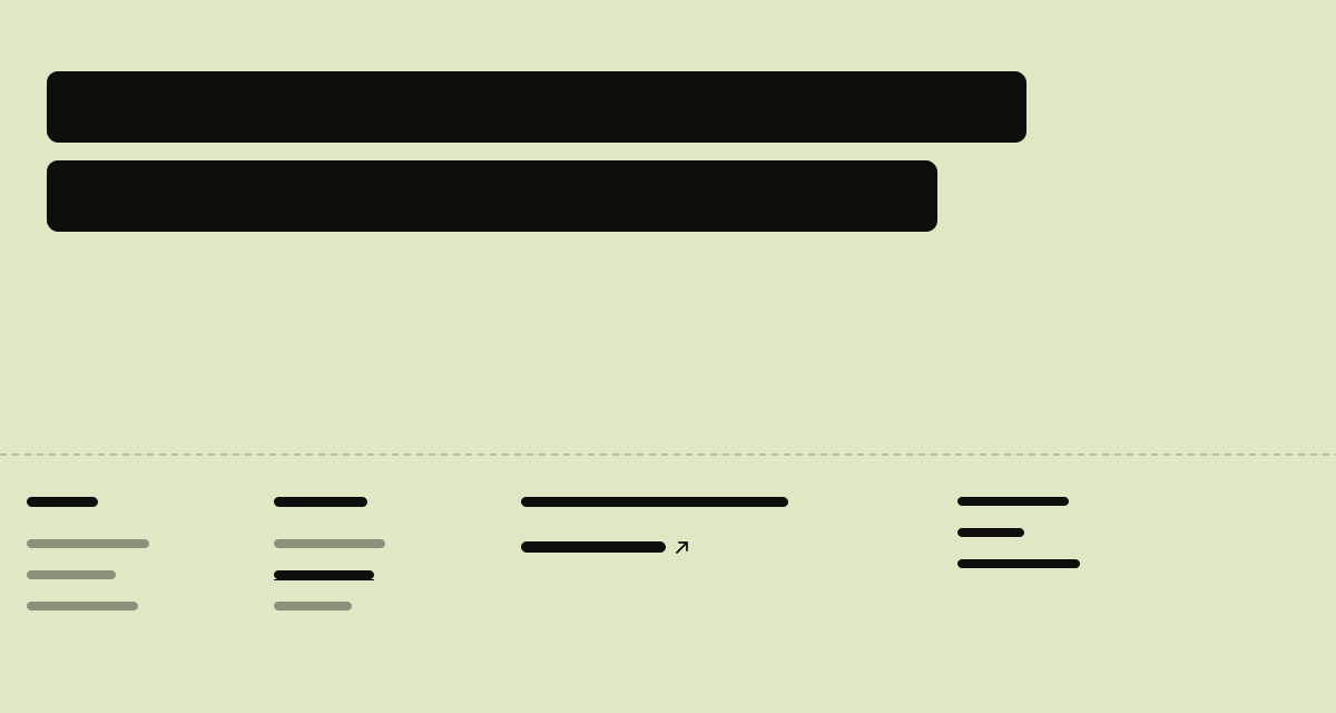
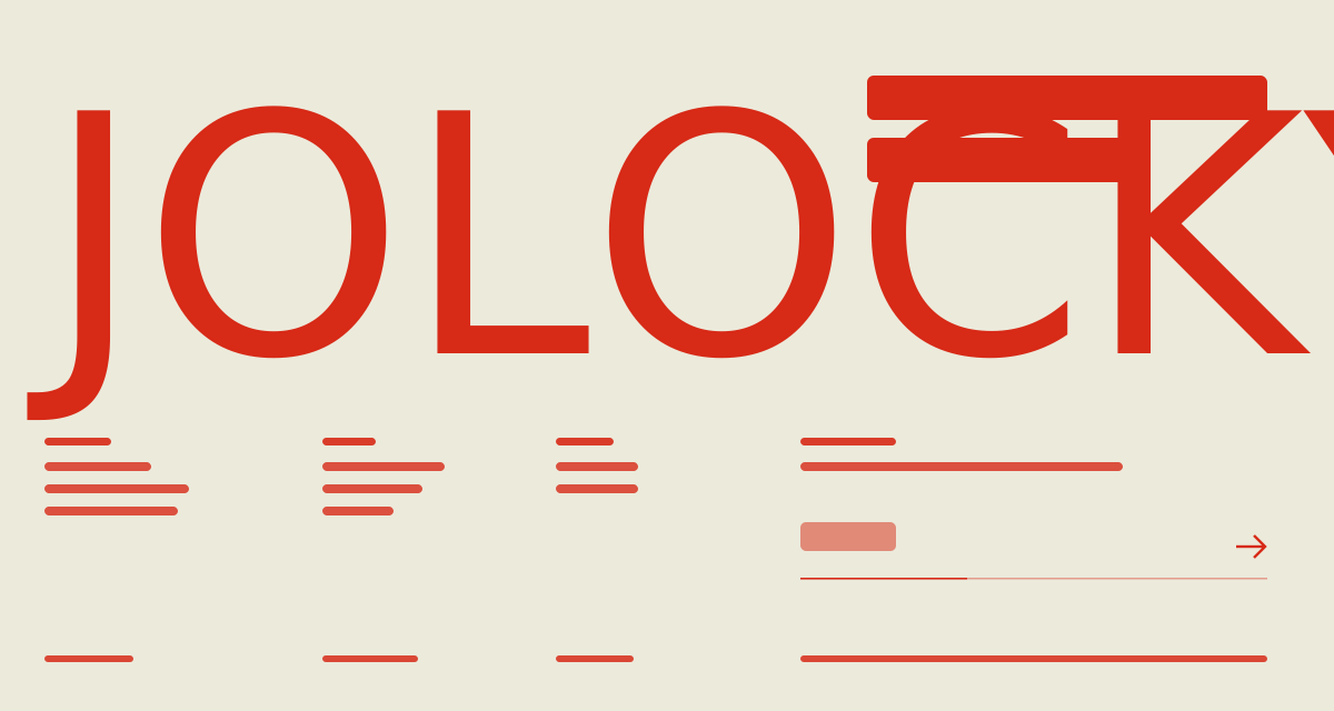
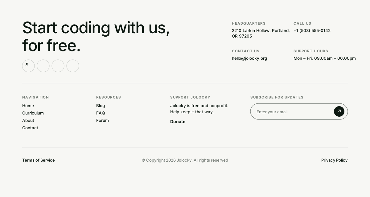
Atelier Spread Footer — A quiet grey footer for a furniture studio, set out like a printed spread. A statement and the link groups sit on the left, a studio letter form and a short note on the right, and a tall photo in the middle drifts against the scroll and zooms a little on hover. Underneath, a huge wordmark in medium weight overlaps the bottom of the photo, and its letters slide up from behind a mask one by one when the footer comes into view, while each block above fades and rises in turn. Hovering turns links the accent red. On mobile the three link groups become an accordion with a plus that turns into a red cross, and the studio note and tagline step out of the way.
Every interaction state, motion curve, and responsive edge-case has been extracted and reconstructed for seamless integration into modern React applications.
01
Zero — Primitive Dependency & Pure Standalone Pattern: pure React and scoped CSS. There is no UI primitive library, no animation library and nothing extra to install. The one outside asset is the photo, which is a prop you point at your own licensed image.
02
Three Layouts: desktop from 1024px has three columns with the photo in the middle (at least 280px, 23% wide) and a top section at least 500px tall. Tablet from 640px keeps the content on the left with a 240px photo column. Mobile is one column with the photo below the links.
03
Wordmark Overlap: the wordmark is 22.9vw on mobile and 20vw from tablet up, and a negative top margin of 0.455em pulls it over the bottom of the photo. Its letters sit in a clipped box, so they slide up from nothing.
04
Reveal When Seen: script switches the motion on first, which hides the blocks, and a class is added once 20% of the footer is visible. Letters rise 55ms apart, then each block fades in and rises 22px, 110ms apart. Without script, or with reduced motion, everything is simply visible.
05
Image Parallax: the position of the photo box against the middle of the screen sets a variable from — 48px to 48px, written on the image from a scroll listener that batches its work into one animation frame. The CSS owns the zoom and the transition, so hover and parallax combine.
06
Accordion With Row Animation: below 640px each group opens by animating its grid row from 0fr to 1fr, the links fade in after a short delay and the plus turns into a red cross. From tablet up the groups are always open and their titles are plain labels.
07
Keyboard Aware: the titles leave the tab order when they are only labels, and the links of a closed group leave it too, so tabbing never lands on something you cannot see.
08
Hover Only Where It Fits: red link colours, the nudge on desktop links and the underline on social links only apply on devices that can really hover.
09
Newsletter Feedback: the browser checks the e — mail, then the button reads Thank you. Pass an onSubscribe handler to send the e—mail to your provider; returning false or throwing shows Try again.
10
Reduced Motion: no reveal, no parallax and every transition is switched off.
Technology Stack
Engineered using established and reliable modern web technologies for peak runtime performance and developer ergonomics.
React
Next.js
TypeScript
Scoped CSS
Zero Primitive
Last Updated
Oct 5, 2026
Tags & Specifications
Image ParallaxMobile AccordionWordmark OverlapLetter Mask RevealStudio LetterZero Primitive
Color Palette
#e6e6e4
#c4391b
Technology Stack
Engineered using established and reliable modern web technologies for peak runtime performance and developer ergonomics.
React
Next.js
TypeScript
Scoped CSS
Zero Primitive