Back to Footers
Inspired by:Jolocky
Added on Oct 4, 2026
Pro Component
Source Code is Locked
Get instant access to complete production TypeScript code & CLI commands.
Kiln Studio Outro
kiln-studio
Editorial & Typography Architecture
Built from scratch by Jolocky, with our own layout, color and motion.
Signature Standard
Precision interaction engineering with zero external runtime bloat.
Pro Commercial Access
Production-ready multi-file tree built for modern Next.js and Tailwind CSS.
Engineering Breakdown
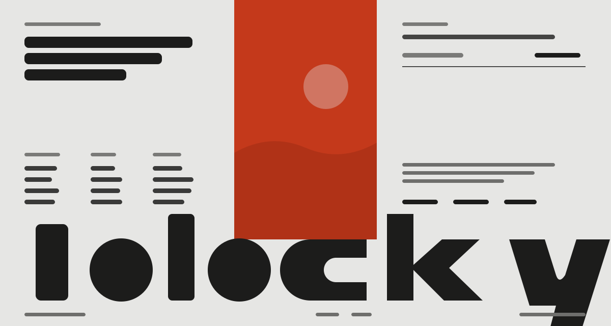
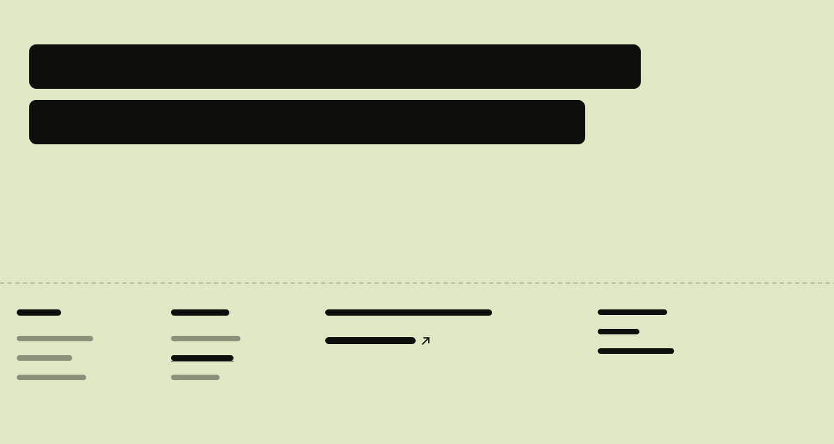
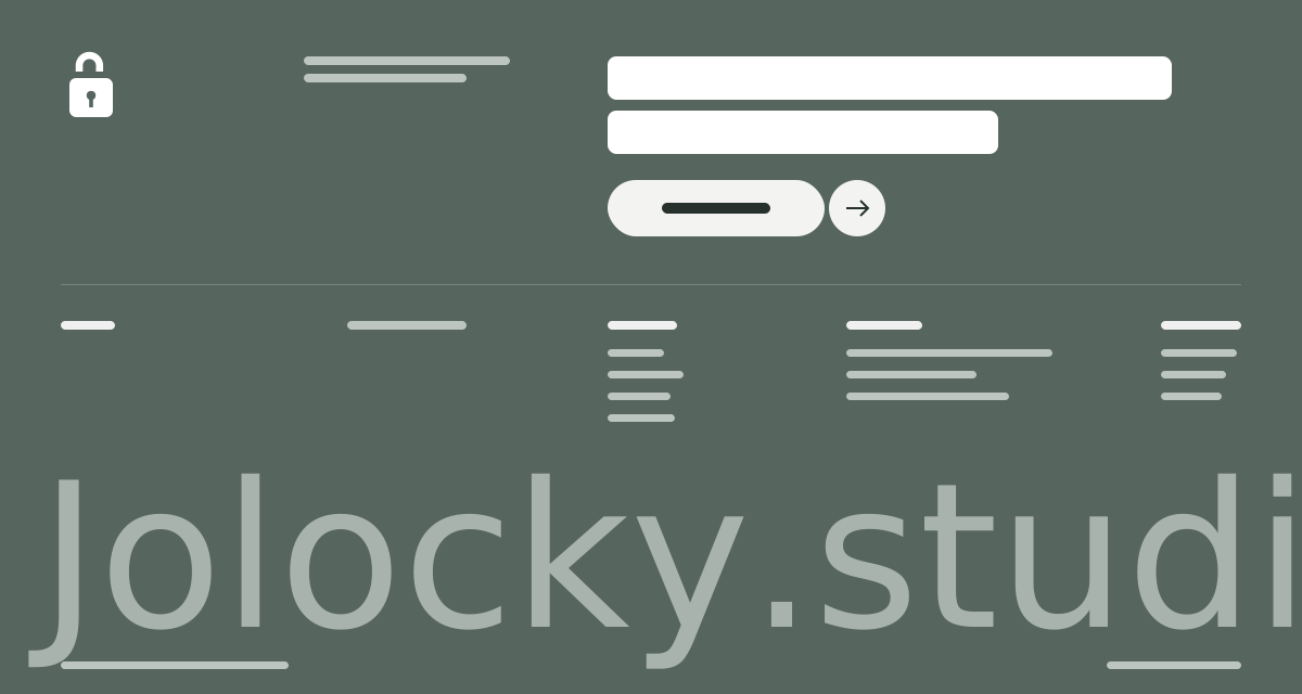
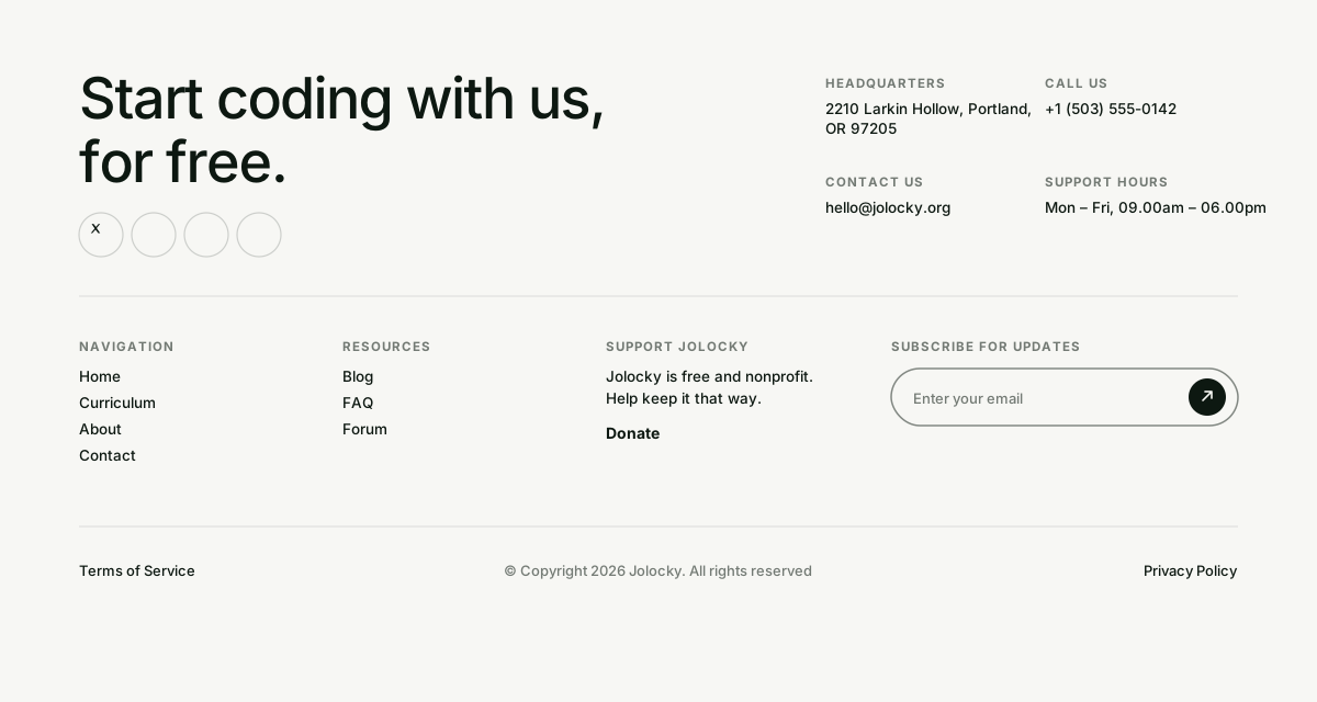
Kiln Studio Outro — A warm cream and red footer for a ceramics studio. One tall condensed wordmark is stretched edge to edge, with a large serif tagline beside it and quiet contact, studio and follow columns below. The newsletter field is the star: a big serif input whose label drifts away on focus, an underline that draws itself, an arrow that flies off when you send, and a thank you note that fades in with a way to start over. Three grid layouts rearrange the same pieces for desktop, tablet and mobile.
Every interaction state, motion curve, and responsive edge-case has been extracted and reconstructed for seamless integration into modern React applications.
01
Zero — Primitive Dependency & Pure Standalone Pattern: pure React and scoped CSS. There is no UI primitive library, no icon package and nothing extra to install.
02
Stretched Wordmark: the word is SVG text with a fixed text length, so it fills the width of its box at any size and scales like an image, with no JavaScript measuring.
03
Named Grid Areas: desktop uses four columns, tablet three and mobile two. On mobile the tagline and newsletter come first and the wordmark moves down to act as a sign off.
04
Fake Placeholder: a label sits inside the big input and drifts to the right and fades on focus, then disappears as soon as you type. The input uses an empty placeholder so :placeholder — shown can tell when it has text.
05
Drawing Underlines: link underlines draw from left to right on hover and keyboard focus. The field underline draws on focus, on error, or whenever the field has a value.
06
Newsletter States: an invalid email shows an inline message and keeps focus on the field. A valid one sends the arrow flying off, then swaps the form for a thank you note. Use another email brings the form back empty and focused.
07
Ready for a Real Request: pass an onSubscribe handler to send the email to your provider. Returning false or throwing shows a failure message under the field.
08
Touch Friendly Mobile: links get 44px tap targets, and the address, Made in Bali line and legal text are hidden to keep the small screen calm.
09
Reduced Motion: every transition and animation is switched off.
Technology Stack
Engineered using established and reliable modern web technologies for peak runtime performance and developer ergonomics.
React
Next.js
TypeScript
Scoped CSS
Inline SVG
Zero Primitive
Last Updated
Oct 4, 2026
Tags & Specifications
Stretched WordmarkSerif TaglineFake PlaceholderGrid AreasNewsletter StatesZero Primitive
Color Palette
#d72a17
#eceadb
Technology Stack
Engineered using established and reliable modern web technologies for peak runtime performance and developer ergonomics.
React
Next.js
TypeScript
Scoped CSS
Inline SVG
Zero Primitive