Back to Footers
Inspired by:Jolocky
Added on Oct 5, 2026
Pro Component
Source Code is Locked
Get instant access to complete production TypeScript code & CLI commands.
Butterfly Glow Headline
butterfly-glow
Light & Glow Architecture
Built from scratch by Jolocky, with our own layout, color and motion.
Signature Standard
Precision interaction engineering with zero external runtime bloat.
Pro Commercial Access
Production-ready multi-file tree built for modern Next.js and Tailwind CSS.
Engineering Breakdown
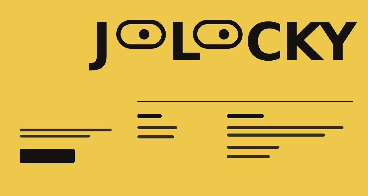
Butterfly Glow Headline — A black footer for an illustrator, with a huge headline whose letters are filled with a soft grey gradient that works like a light. The light eases toward your pointer and drifts around on its own on tablets and phones, where there is no pointer. The geometric butterfly logo flaps its wings on hover and on tap. Three email addresses sit under the links, and clicking one copies it and shows a small toast, with a fallback to the mail app when the clipboard is not available. A fine grain texture covers the whole footer, and the layout reshapes from a wide desktop grid to a stacked mobile column.
Every interaction state, motion curve, and responsive edge-case has been extracted and reconstructed for seamless integration into modern React applications.
01
Zero — Primitive Dependency & Pure Standalone Pattern: pure React and scoped CSS. There is no UI primitive library, no icon package, no image files and nothing extra to install.
02
Gradient Light in the Letters: the headline is transparent text over a radial gradient clipped to the letters. The gradient center sits at two CSS variables, so moving the light never forces the text to re — layout.
03
Eased Pointer Light: every frame the light covers 10% of the distance to the pointer, measured from the headline's corner, and it stops writing once it is within 0.3px. When the pointer leaves, the light goes back to its resting spot at 62% across and 45% down.
04
Self — Drifting on Touch: at 1024px and below, or on devices that cannot hover, the light follows a slow sine path whenever no pointer has moved for 2.5 seconds. It switches between pointer and drift by itself.
05
Butterfly Logo: the wings are four polygons that squeeze sideways to 18% in a 0.55 second loop while hovered. A tap on touch devices keeps the flap going for 1.65 seconds, and mouse presses are ignored so hover stays in charge.
06
Click to Copy With Toast: each email copies on click and a toast reads Copied with the address for 1.8 seconds. Both emails share one timer, and a failed clipboard opens the mail app instead.
07
Headline Sized by Viewport: the headline font size is the smaller of 150px and a share of the viewport width, so the two words always fit beside the links on desktop, above them on tablet and across the screen on mobile.
08
Three Layouts: desktop places the logo, links and contacts left of the headline. Tablet puts the logo and headline on top of a two column area, and the contacts stack. Mobile uses one column, hides the Sketchbook and Testimonials links and puts the social tiles first in the bar.
09
Reduced Motion: the light stays at rest, the logo does not flap and every transition is switched off.
Technology Stack
Engineered using established and reliable modern web technologies for peak runtime performance and developer ergonomics.
React
Next.js
TypeScript
Scoped CSS
Inline SVG
Zero Primitive
Last Updated
Oct 5, 2026
Tags & Specifications
Gradient Text LightPointer GlowButterfly FlapClick to CopyGrain TextureZero Primitive
Color Palette
#0b0b0b
#e8e8e8
#9b9b9b
#f2f2f2
Technology Stack
Engineered using established and reliable modern web technologies for peak runtime performance and developer ergonomics.
React
Next.js
TypeScript
Scoped CSS
Inline SVG
Zero Primitive