Back to Footers
Inspired by:Jolocky
Added on Oct 5, 2026
Pro Component
Source Code is Locked
Get instant access to complete production TypeScript code & CLI commands.
Fitted Wordmark Outro
fitted-wordmark
Kinetic Typography Architecture
Built from scratch by Jolocky, with our own layout, color and motion.
Signature Standard
Precision interaction engineering with zero external runtime bloat.
Pro Commercial Access
Production-ready multi-file tree built for modern Next.js and Tailwind CSS.
Engineering Breakdown
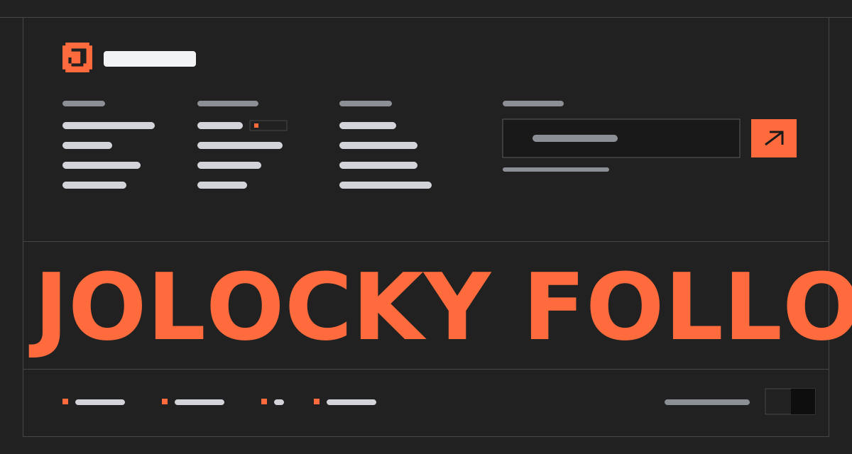
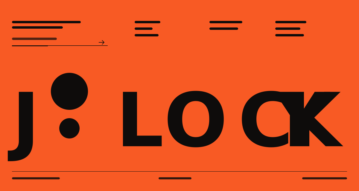
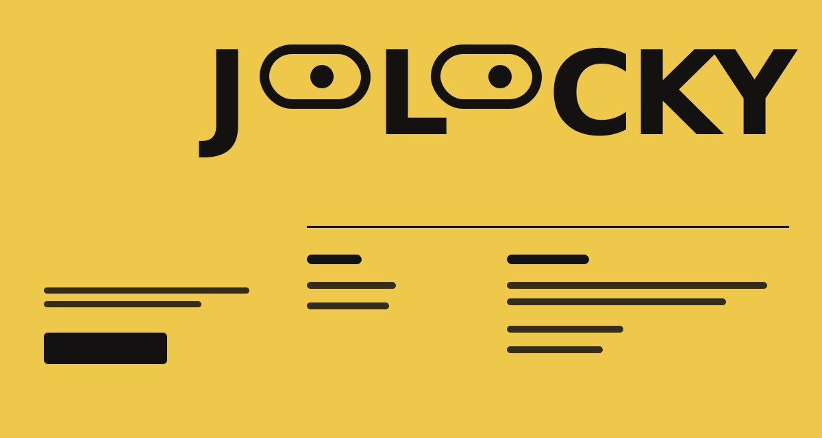
Fitted Wordmark Outro — A near white footer with a huge wordmark that stretches itself to exactly the width of the footer. When the footer scrolls into view, hairline rules draw in and each letter rises from behind a mask, and both replay when you scroll back to it. On devices with a mouse the letters near the cursor grow wider and bolder while the word keeps its full width. Links swap to ink with a vertical slide on hover and keyboard focus. On desktop an About column sits beside Worldwide, Contact and Learn. On tablet and mobile a big statement line replaces the About text and the columns rearrange under it.
Every interaction state, motion curve, and responsive edge-case has been extracted and reconstructed for seamless integration into modern React applications.
01
Zero — Primitive Dependency & Pure Standalone Pattern: pure React and scoped CSS. There is no UI primitive library, no icon package and nothing extra to install.
02
Self Fitting Wordmark: the word is real text in a variable font. Its size is corrected up to four times until it spans the footer width, and it runs again when the footer resizes and when the fonts finish loading.
03
Cursor Reaction: letters near the pointer get wider and heavier by a Gaussian falloff that eases at 14% per frame. The whole word is scaled back after every frame, so it always keeps the full width.
04
Three Intensities: the intensity prop switches between subtle, medium and dramatic, which change how far the effect spreads and how strong it gets. The effect only runs on devices with hover and fades out 180px away from the word.
05
No Re — renders While Moving: font settings, sizes and transforms are written straight to the DOM. Only the reveal state lives in React.
06
Replaying Reveal: once 15% of the footer is visible the rules draw in over 1.4 seconds and the letters rise with a 65ms stagger. Scrolling back above the footer resets it so it plays again.
07
Slide Swap Links: a copy of the label sits below each link and both slide up together on hover and keyboard focus, so the text swaps to ink. Focus also adds an underline.
08
Three Layouts With CSS: desktop from 1024px has two vertical dividers and a legal row inside the right block. Tablet from 640px hides About and shows the statement. Mobile puts Learn and Contact side by side, Worldwide below them, and hides the Privacy link.
09
Reduced Motion: every transition is switched off, the reveal shows at once and the cursor effect does not run.
Technology Stack
Engineered using established and reliable modern web technologies for peak runtime performance and developer ergonomics.
React
Next.js
TypeScript
Scoped CSS
Zero Primitive
Last Updated
Oct 5, 2026
Tags & Specifications
Variable Font WordmarkCursor ReactionScroll RevealSlide Swap LinksDrawn RulesZero Primitive
Color Palette
#fdfdfc
#111110
#7a7a77
#8d8c85
#8e8e8b
Technology Stack
Engineered using established and reliable modern web technologies for peak runtime performance and developer ergonomics.
React
Next.js
TypeScript
Scoped CSS
Zero Primitive