Back to Footers
Inspired by:Jolocky
Added on Oct 5, 2026
Spotlight Wordmark Outro
spotlight-wordmark
Gradient & Ambient Motion Architecture
Built from scratch by Jolocky, with our own layout, color and motion.
Signature Standard
Precision interaction engineering with zero external runtime bloat.
Open Source Registry
Production-ready multi-file tree built for modern Next.js and Tailwind CSS.
Engineering Breakdown
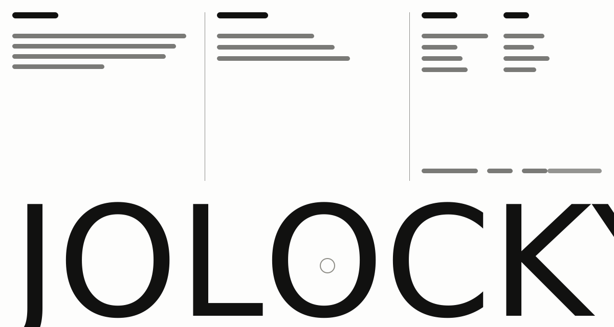
Spotlight Wordmark Outro — A deep green black footer with a mint wordmark that reacts to you. The studio name is drawn across the full width in a soft gradient, and a bright spotlight follows your cursor over it with a gentle lag. On touch screens the light follows your finger instead. Above it sit a short brand blurb and four link columns whose underlines draw in on hover. On tablet the columns drop below the brand, and on mobile they turn into thumb sized rows with the social links gathered underneath.
Every interaction state, motion curve, and responsive edge-case has been extracted and reconstructed for seamless integration into modern React applications.
01
Zero — Primitive Dependency & Pure Standalone Pattern: pure React and scoped CSS. There is no UI primitive library, no icon package and nothing extra to install.
02
Cursor Spotlight: a radial gradient fills a second copy of the wordmark. Its centre covers 14% of the remaining distance to the pointer on every animation frame, which gives the soft lag, and the layer fades in over half a second while the pointer is inside the footer.
03
No Re — renders While Moving: the light position is written straight to the SVG gradient, so moving the pointer never re—renders the component. Only the lit or unlit state lives in React.
04
Touch Support: dragging a finger over the footer moves the light the same way, and lifting it turns the light off.
05
Readable at Any Size: the light has a radius of 320 on a wide wordmark, 340 below 1000px and 420 below 500px, so it still reads when the wordmark gets small.
06
Gradient Wordmark: the word is SVG text with a fixed text length, stretched edge to edge and filled with a horizontal gradient that fades out at both ends.
07
Link Visibility Control: each link can be limited with desktop — only, hide—desktop or hide—mobile, and a whole column can be marked desktop only, so each layout shows just the links it needs.
08
Drawing Underlines: link underlines grow from the left on hover and keyboard focus. On mobile the links become 44px tall rows with a quiet social strip underneath.
09
Reduced Motion: the light jumps straight to the pointer without easing, and the underline and fade transitions are switched off.
Technology Stack
Engineered using established and reliable modern web technologies for peak runtime performance and developer ergonomics.
React
Next.js
TypeScript
Scoped CSS
Inline SVG
Zero Primitive
Last Updated
Oct 5, 2026
Tags & Specifications
Cursor SpotlightGradient WordmarkTouch FollowUnderline LinksResponsive ColumnsZero Primitive
Color Palette
#0a0c0b
#f2f2f0
#47c496
#a6fed7
Technology Stack
Engineered using established and reliable modern web technologies for peak runtime performance and developer ergonomics.
React
Next.js
TypeScript
Scoped CSS
Inline SVG
Zero Primitive