Back to Footers
Inspired by:Jolocky
Added on Oct 5, 2026
Vibe Together Footer
vibe-together
Outro & CTA Architecture
Built from scratch by Jolocky, with our own layout, color and motion.
Signature Standard
Precision interaction engineering with zero external runtime bloat.
Open Source Registry
Production-ready multi-file tree built for modern Next.js and Tailwind CSS.
Engineering Breakdown
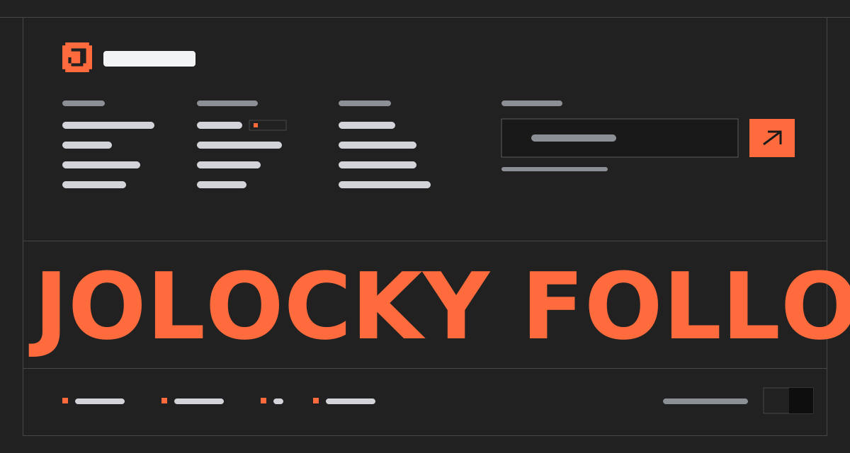
Vibe Together Footer — A near black footer for a creative studio, opening with a huge headline that slides up word by word from behind masks, two outlined pill buttons that fill with ink on hover and a column of large social links. Under them a custom vector wordmark spans the whole width, with every letter rising from below on its own. The bottom bar carries the credits and a small language badge for Singapore's four languages: it opens a list that unrolls to its left, turns into a cross while open and closes on a pick, a press outside or Escape. The footer takes its height from its content and its sizes from fluid units, so it adapts to the width of its container rather than the window.
Every interaction state, motion curve, and responsive edge-case has been extracted and reconstructed for seamless integration into modern React applications.
01
Zero — Primitive Dependency & Pure Standalone Pattern: pure React and scoped CSS. There is no UI primitive library, no animation library, no icon package and nothing extra to install. The wordmark is inline SVG, so only the Archivo font is loaded.
02
Compact Content Height: no 100vh and no fixed heights. Paddings, gaps and font sizes use clamp with container units, tuned small, and the wordmark stops growing at 920px wide. The footer takes about 600px at a desktop width, so it grows with its content and never shows empty space or clips.
03
Container Query Breakpoints: the footer is its own container. Under 700px is mobile, from 700px the bottom bar splits its credit in two, and from 1100px it becomes a four part grid with All rights reserved on the right. The social column also moves in from the right edge with a margin that grows with the width.
04
Masked Headline: each word sits in a clipped box and slides up from 105% below, 90ms after the one before. The headline is exposed to screen readers as one phrase, and the animated words are hidden from them.
05
Reveal Once: the hidden state is only switched on after script runs and only when motion is allowed, so the content never depends on JavaScript to be visible. When 25% of the footer is visible, the headline words, then the blocks and then the wordmark letters come in with their own staggers.
06
Wordmark Letters: seven groups, one per letter, built from paths and rings with thick strokes. The tops of the tall letters have a slanted cut, and each group rises 140 units from below, 60ms apart.
07
Language Picker: the list is positioned to the left of the badge with a black background, so it covers the text beside it, and opens by animating its max width from 0 to 420px. The badge shows the current code, turns into an outlined cross while open, and the current option is marked with aria — current. Each option has its own lang attribute.
08
Closes Three Ways: picking a language, pressing anywhere outside, or pressing Escape. Picking and Escape return focus to the badge. Pass onLanguageChange to connect it to your locale store.
09
Pill Buttons: outlined with a faint border, they invert to ink background and black text on hover and keyboard focus.
10
Reduced Motion: everything is visible at once and the reveal and transitions are skipped.
Technology Stack
Engineered using established and reliable modern web technologies for peak runtime performance and developer ergonomics.
React
Next.js
TypeScript
Scoped CSS
Container Queries
Inline SVG
Zero Primitive
Last Updated
Oct 5, 2026
Tags & Specifications
Masked HeadlineVector WordmarkLanguage PickerContainer QueriesPill ButtonsZero Primitive
Color Palette
#050505
#f4f3ef
Technology Stack
Engineered using established and reliable modern web technologies for peak runtime performance and developer ergonomics.
React
Next.js
TypeScript
Scoped CSS
Container Queries
Inline SVG
Zero Primitive