Back to Footers
Inspired by:Jolocky
Added on Oct 5, 2026
Pro Component
Source Code is Locked
Get instant access to complete production TypeScript code & CLI commands.
Graphite Marquee Outro
graphite-marquee
Kinetic Typography Architecture
Built from scratch by Jolocky, with our own layout, color and motion.
Signature Standard
Precision interaction engineering with zero external runtime bloat.
Pro Commercial Access
Production-ready multi-file tree built for modern Next.js and Tailwind CSS.
Engineering Breakdown
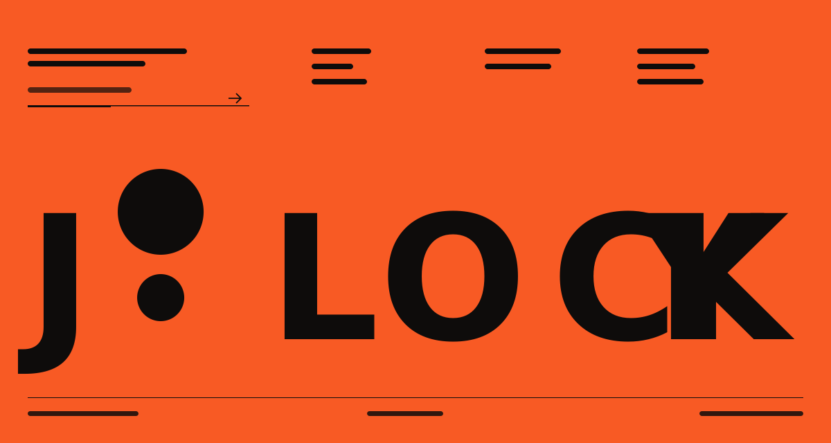
Graphite Marquee Outro — A graphite footer with an orange accent, a pixel grid logo and three link columns beside a newsletter signup. A band of huge pixel type scrolls endlessly between hairline rules, and the bottom row holds the social links and a light and dark toggle that remembers your choice. The layout follows the width of the footer itself instead of the screen, so it adapts correctly inside any page wrapper. Everything fades up as it scrolls into view, and the signup moves through error, loading and success states with a shake, a three square loader and a check.
Every interaction state, motion curve, and responsive edge-case has been extracted and reconstructed for seamless integration into modern React applications.
01
Zero — Primitive Dependency & Pure Standalone Pattern: pure React and scoped CSS. The logo and every icon are inline SVG, so there is no UI primitive library, no icon package and nothing extra to install.
02
Container Query Layout: the footer is its own size container, and the tablet layout starts at 640px and the desktop layout at 1100px of footer width. It stays correct inside narrow wrappers and side panels, not only on narrow screens.
03
Height From Content: there is no viewport height anywhere. To keep it at the bottom of a short page, let the page shell do that with a grid or flex layout.
04
Pixel Marquee: the band text is drawn twice and slides left by half its width on a linear loop, 22 seconds on mobile, 30 on tablet and 40 on desktop. The type is trimmed to its cap height so the letters sit centred in the band.
05
Stepped Reveal: once 10% of the footer is on screen the brand and columns fade up with an 80ms stagger, and the marquee band rises from below its clip in five pixel steps. It only runs once, and without IntersectionObserver everything simply shows.
06
Theme Toggle: the dark and light colours are CSS variables switched by a data attribute. The choice is saved in localStorage under a key you can change, and every footer on the page stays in sync. The server render and first hydration pass use dark.
07
Signup State Machine: idle, error, loading and success. An invalid email shakes the form in six steps and focuses the field. While loading three squares light up in turn every 130ms, and success goes back to idle after five seconds.
08
Subscribe Handler: pass onSubscribe to connect a real endpoint. Return false or throw to show the failure message. Without it the demo waits 1.4 seconds and succeeds.
09
Interactive Links: hovering or focusing a link turns it orange and nudges it 4px right, with a visible focus ring. The GitHub star badge only shows on wide footers.
10
Reduced Motion: the marquee stops, the reveal shows everything at once and the shake is switched off.
Technology Stack
Engineered using established and reliable modern web technologies for peak runtime performance and developer ergonomics.
React
Next.js
TypeScript
Scoped CSS
Inline SVG
Container Queries
Zero Primitive
Last Updated
Oct 5, 2026
Tags & Specifications
Pixel MarqueeContainer QueriesTheme ToggleScroll RevealNewsletter StatesZero Primitive
Color Palette
#212121
#ff6b3d
#d2d4d9
#f2f3f5
#ebeae6
Technology Stack
Engineered using established and reliable modern web technologies for peak runtime performance and developer ergonomics.
React
Next.js
TypeScript
Scoped CSS
Inline SVG
Container Queries
Zero Primitive